Curinos Optimizer
Creating a brand-new product from scratch is a tall feat, but it is only met by the consequent challenge of building a product that consistently drives value and increased engagement. Let me share with you how I juggled constraints, tight timelines, multiple stakeholders, and competing priorities to achieve these goals.
My Role
I was part of a small engineering team alongside our product manager, data scientist, and customer success partner. I led the UX work, producing all major design deliverables and presenting these to the client between March 2024 and June 2024.
The Challenge:
Our new analytics dashboard release met our short-term goal of having new clients log in once per week, but we noticed that the average was trending down in the second month. This decreasing engagement forced us to move quickly so we didn’t lose any momentum. Our goal was to drive value and increase user engagement on a monthly basis.
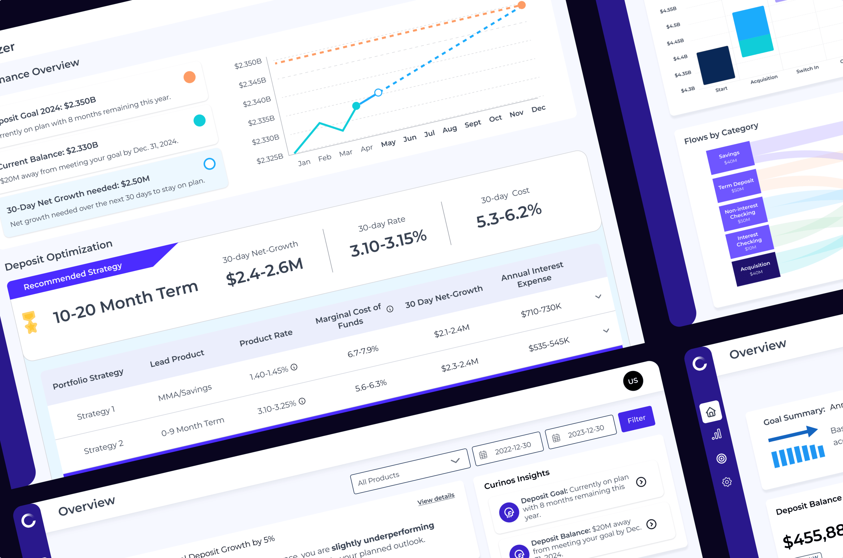
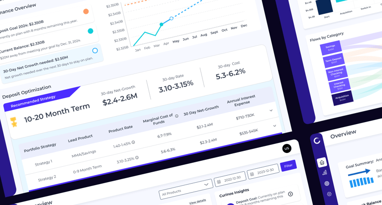
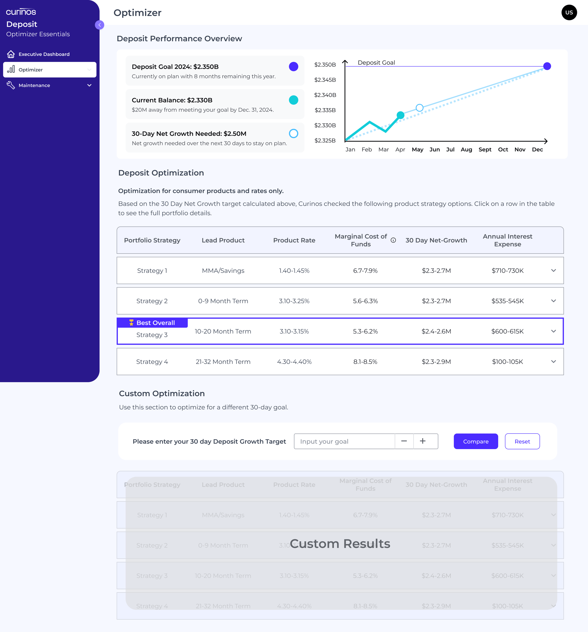
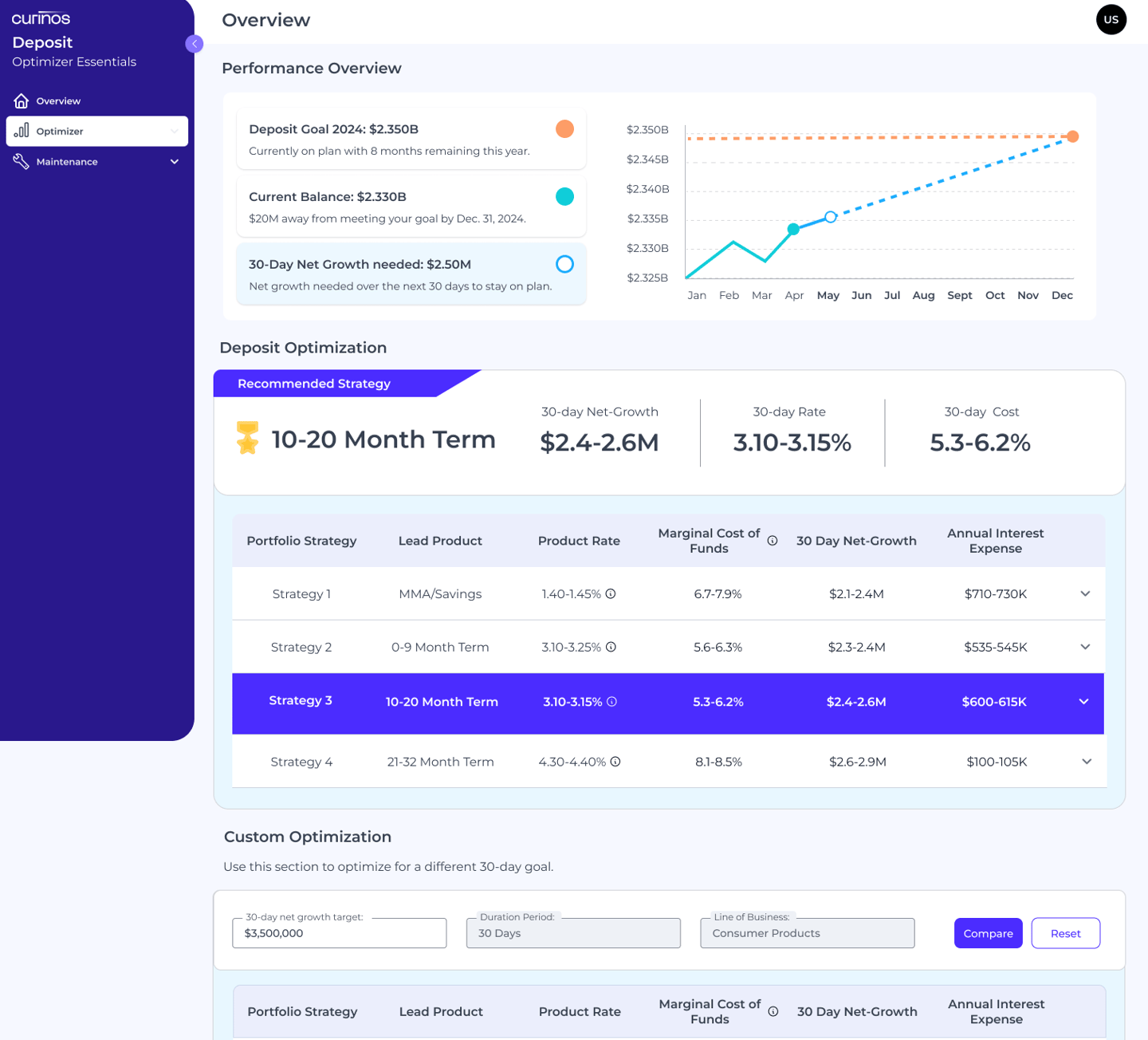
Our clients used the analytics dashboard to examine data and get a sense of where they are today, but it didn’t help them plan. Given this need, we wanted to build a tool to do just that. Our new forecasting feature would expand their ability to plan ahead and suggest products and rate changes to achieve future growth. If successful, customers would use the forecasting feature monthly and grow deposit accounts based on our recommendations.
The Vision:
The Approach
We decided to leverage our established beta program which gave us access to our current clients bi-weekly. This allowed us to get direct feedback and test early design concepts. During our calls, we would ask our clients how they currently do forecasts and who usually gets involved in their process.
We learned the following about their forecasting process:
Very long manual comparison of rates and products across competitors
Responsible for multiple products and monthly reporting
Lack of data markers to understand the bigger trends in a fiscal year
The Discovery
We initially used a proto persona based on Financial Officers, or treasurers, to build our MVP Dashboard, but after our in-depth calls, we realized that other team members took part in their very manual process too. This made us refine the user journey and create new personas to guide our design decisions.
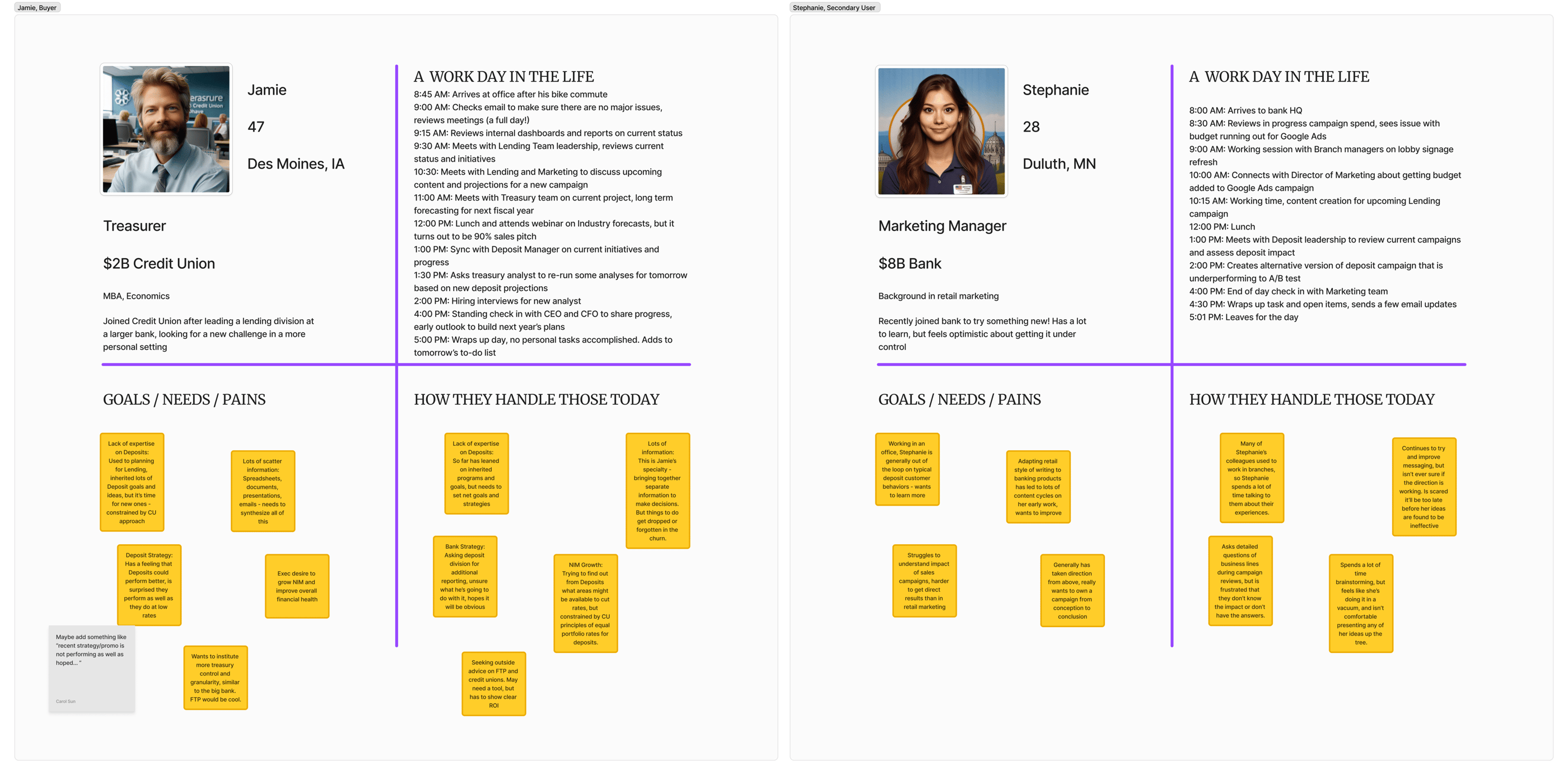
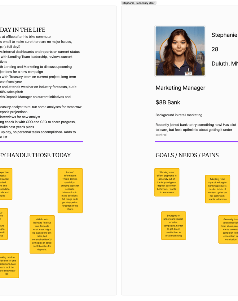
Persona Refinement
One key finding that stood out was that our main user type, treasurers, typically reviewed monthly or quarterly forecast reports created by program or marketing managers. This was important because it allowed us to understand who would use our forecasting tool, their range of knowledge, and their overall capacity. This would also affect our user journey as we did not want to overcomplicate the experience for non-technical users.
Getting on the same page
Our product owner wanted to make this new feature flexible and customizable to any scenario our client needed, and she wanted to get this feature out by July 1st. However we had technical constraints from the engineering perspective and I voiced my concern by highlighting the UI complexity. After sharing my key findings she agreed to pare it down.
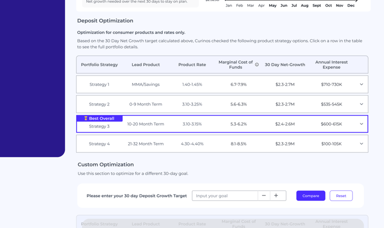
We also limited how many products or rates the client could see results for, so we grouped the most common product types into four major categories. Lastly, we decided to only include one custom input field for users to interact with.
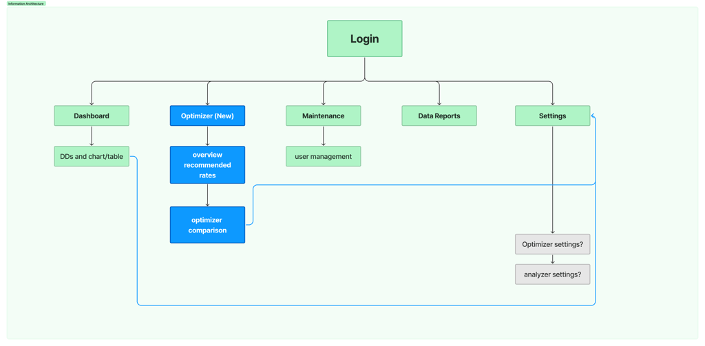
The Framework
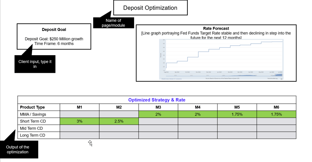
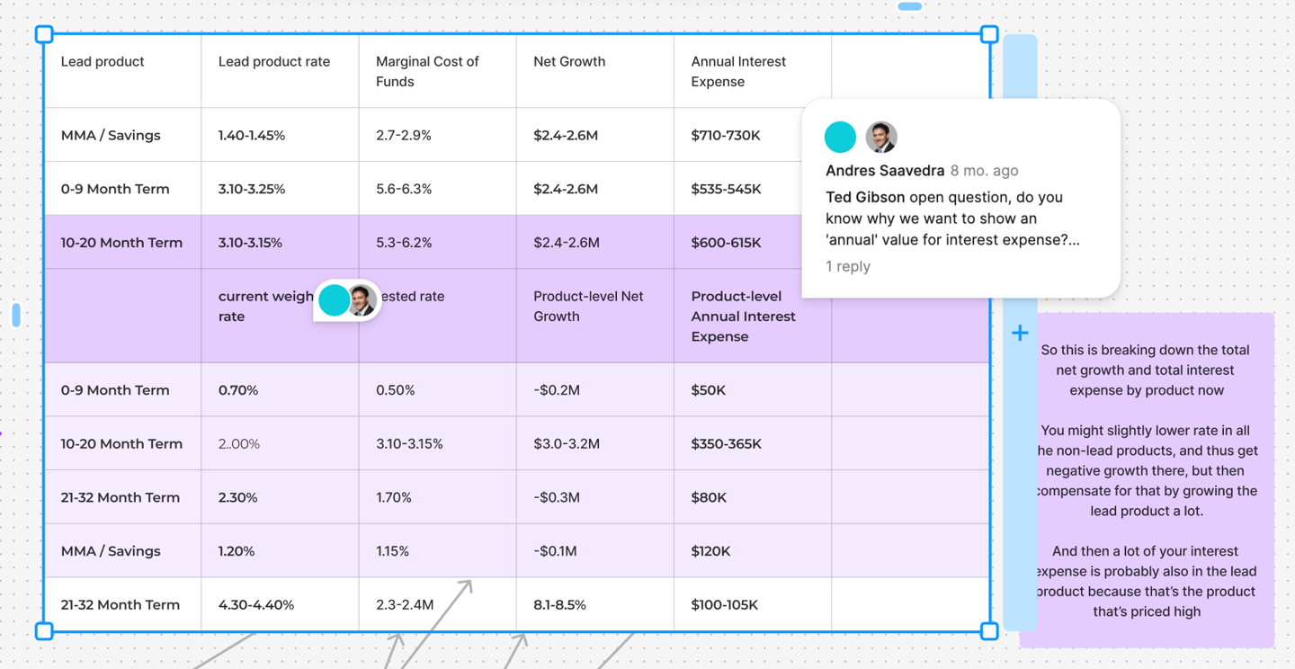
We formed a steering committee composed of the product manager, product owner, myself, and our lead data scientist. This allowed us to create a detailed workback schedule with major milestones for our engineering, data methodology, and design efforts. While the methodology work was in progress, I started to lay out the three core pieces of the new forecasting tool: a prominent graph showing rates over time, an input field, and a results table.

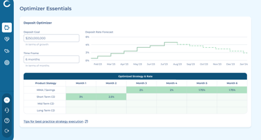
During our team meetings, I would bring my latest wireframes to help guide the design direction. After the first review of wires, we decided to change the graph so it would show our customer’s data over time versus the fed rate data.
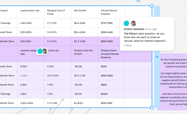
This was my first time creating a forecasting tool with complex data sets, so I also held separate ad-hoc meetings with our data scientist to understand how to translate these inputs into a digestible table UI.
Setting the Design Direction
The Execution
Even though the forecasting tool was still in development our sales and marketing teams were already selling our idea as ‘ready-to-go’ so obviously customers wanted to see a live demo ... .this put me in a tight spot and so I had to whip up a quick prototype to be used during their sales calls.
Additionally our product owner had some last minute thoughts about my use of colors, which she felt might be too different from our legacy products. So I utilized our main indigo throughout the dashboard to bring a subliminal sense of calm and trust while users scanned through many changing numbers and graphs. This also brought it back into brand standards - a plus for my product owner.
Marketing Roadshow
This was an unexpected task, but it gave us some very early feedback on our designs, which we had not even surfaced with our current clients, so this was fresh and very raw feedback.
#1 key change: The most crucial feedback we got was that we displayed too much information at once. Originally we planned to put in four categories and have them drill into all available products, but this was too overwhelming.
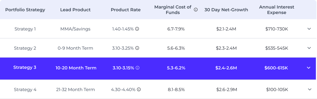
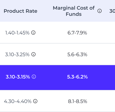
#2 key change: The results table was supposed to highlight a specific category of product and rates to follow, but this was lost in the middle of all the data. We had to make this more clear, so I highlighted our recommended best strategy in a large banner directly above the main results table.

All hands on deck
After making the updates we reviewed our concept with engineering. Since we had put together a steering co. to manage all moving pieces from the start, we ensured our engineering team was informed from the beginning so we got the green light. The only concern was time, as always we were just always short on time, so we needed to pull some extra resources to get this across the proposed July 1st finish line.
The Impact
With a fast-moving timeline, competing priorities, and complicated data sets to manage, we barely made our July 1st deadline, but we treated this as the MVP of the feature so fast-follow plans were already put in place. But even with our semi-clunky solution in production our users found it interesting to play with and look at, which drove up our average daily time spent by 40% and we saw an increase in unique users as well!
A few months after this feature was released we signed 4 new clients, which brought us up to 8 total for the year and on track with our long term goals of 8-10 new clients by EOY.
Measures of Success
20%
4
New Clients
MAU increase