Bravely
Bravely is the only on-demand coaching solution built to provide transformative company-wide coaching for every employee at all levels so they can thrive throughout the career moments that matter.

Bravely’s website had one main function: book on-demand coaching sessions, but with a saturated niche a new product vision was needed for it to stay relevant.
The problem:
The solution:
Incorporate Bravely’s existing website and features into a new employee navigation and dashboard experience.
Me and a Visual Designer
My Team
3 months for MVP release and fast-follow with new features.
Timeframe
Leaning on previous research
We didn’t start with a blank slate, but we also didn’t have very deep user research. The marketing team had existing research notes and user data which gave us enough of an understanding of who our core customer was. To broaden and build on that perspective, I conducted a secondary research of alternative coaching platforms like Placement and Boldly. And I studied established learning products such as Coursera to understand how they structure dashboards, connect features, and guided users through educational content.
Key Takeaways: Most of these dashboards utilized similar sections such as to-do lists, courses, and profile customization. But the best ones used cohesive UI and brand patterns to bring a sense of unity when moving between features. That insight shaped how I approached Bravely’s dashboard: not as a collection of features, but as a unified product experience where coaching and learning felt intentionally connected.
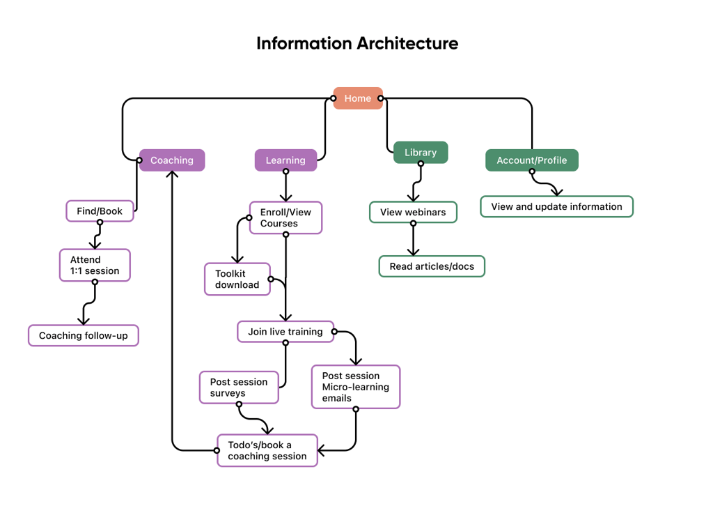
Defining a new journey
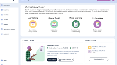
The product team unveiled a new vision for their product which would be migrating from a content based website to a feature based guided learning experience. The first step was to integrate their existing coaching features with a new 'Learning' educational feature, enabling users to engage with educational video content. These two features became the cornerstones of our app shaping our key user flows and overall layout.
Ideation focused on speed
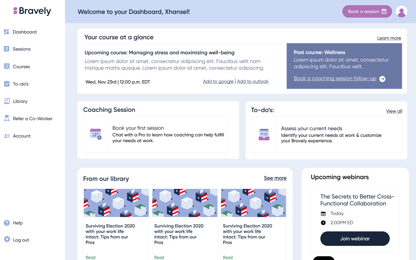
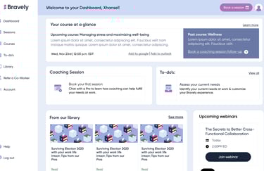
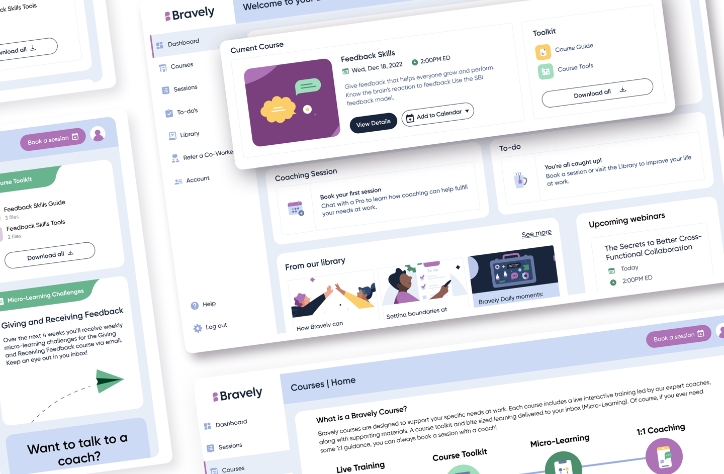
Given our small team and tight timeline we took a Lean UX approach: use what we knew, validate quickly, and refine through real usage rather than waiting for perfection. With a new user flow in mind and some sketches later, I reviewed a low-fidelity prototype of our new dashboard layout with my product manager. It incorporated our key content pieces along with our new 'learning' feature module.
With a short timeline ahead of us we decided to quickly prototype this design after a few tweaks. We then gathered some current clients and tested our ideas through a moderated usability test.
Usability testing
We decided to interview five current users over Zoom. Each call would be around 45 minutes long and provide a moderated testing environment.
The main learnings:
Overall, users found the navigation intuitive and could easily move between menu options.
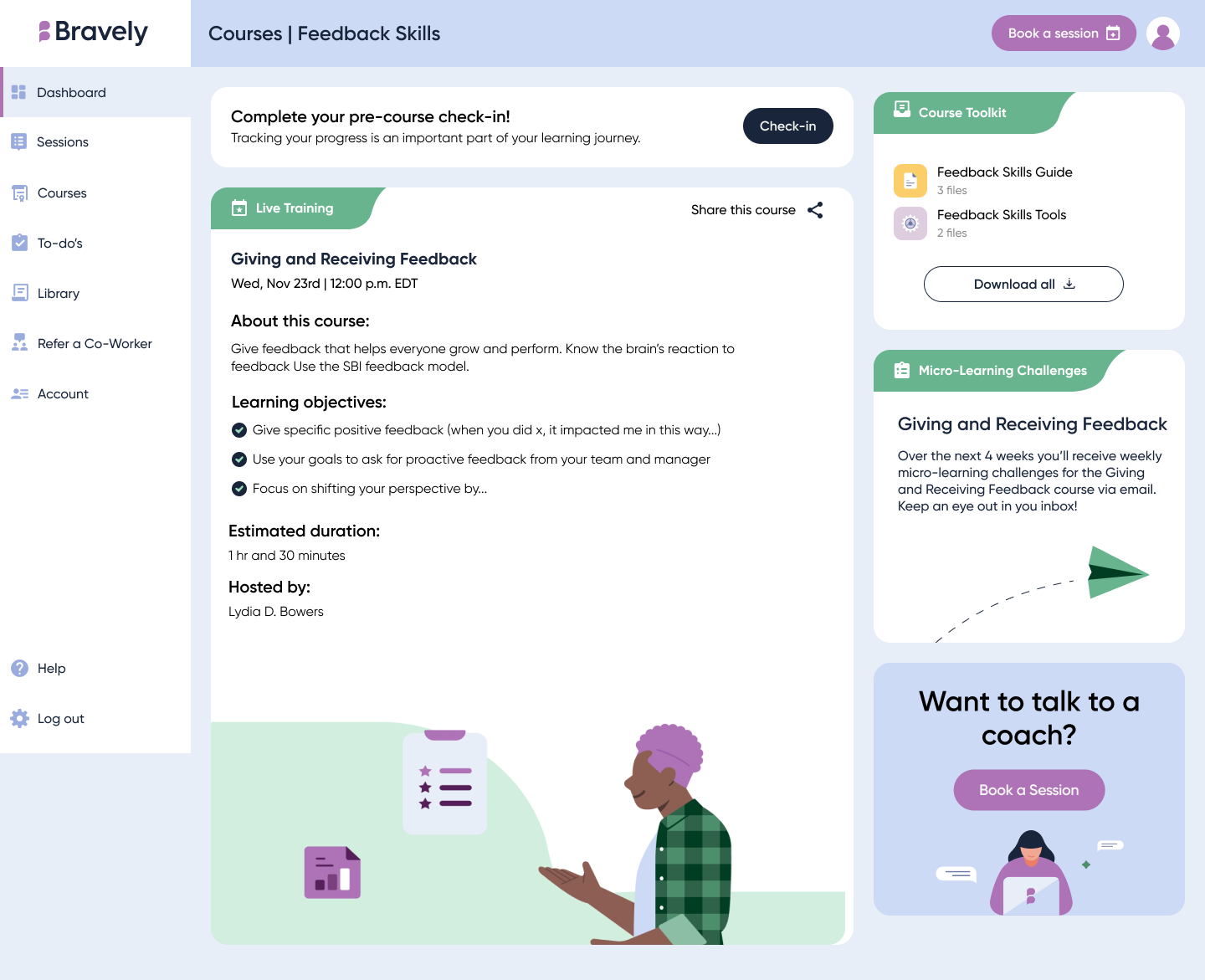
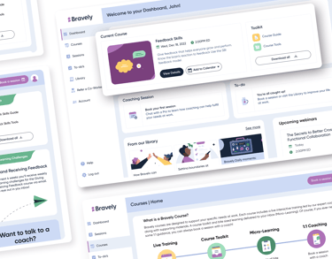
The employee dashboard, particularly the “Courses” section, felt overwhelming and was perceived as "text-heavy."
Users struggled to understand the course journey and didn't immediately connect live training, micro-learning, and the toolkit as part of a cohesive experience.
Refining the design
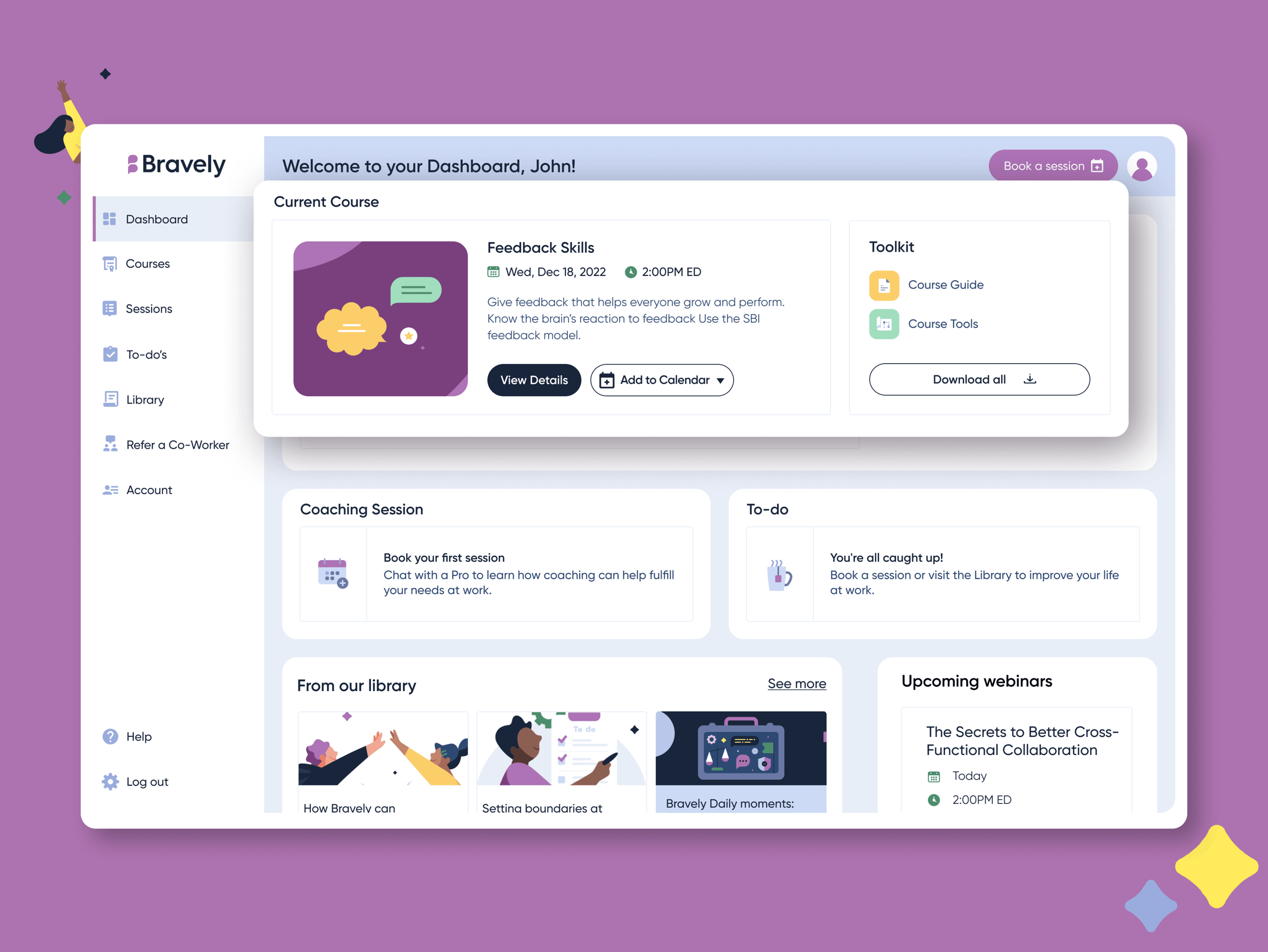
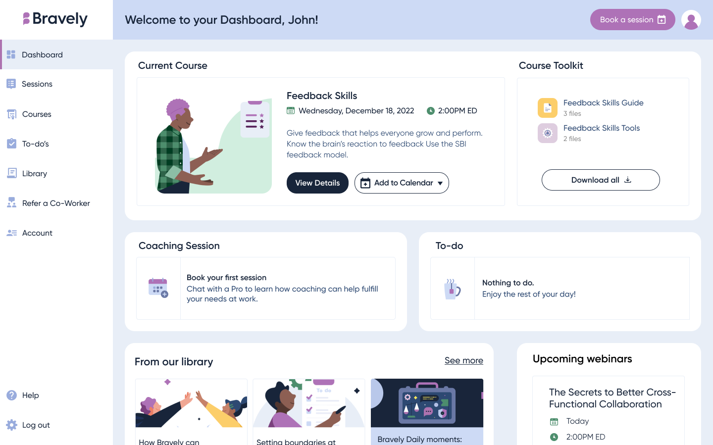
1. A more appealing dashboard:
We incorporated more visuals and clear CTAs to create an appealing yet functional view.
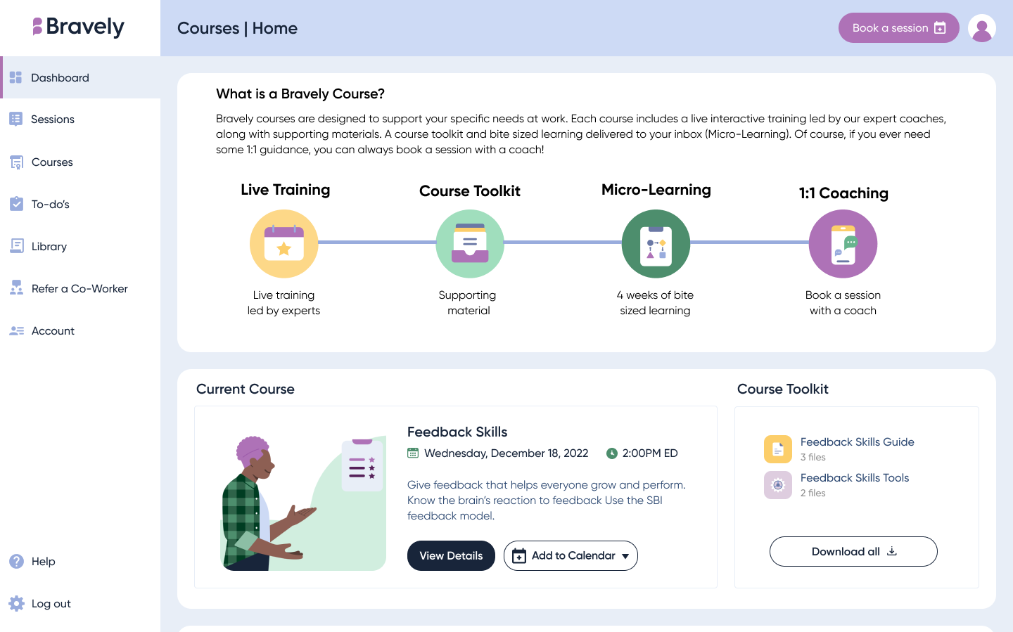
2) Visuals for the Course Journey:
Users had trouble understanding the course journey so I added an info-graphic in the overview section to make the connection a bit clearer
3) Course details and new branding:
Users requested a way to share a course with peers/co-workers as well as a clear way to tell how long a course would take. We also added branding elements to connect live training, micro-learning, and the tool kit together in one place.
Iterate and Build
Our Visual designer provided additional support on the overall branding and visual direction, while I provided all UX flows and final screens for developer handoff. During sprint planning, we reviewed and groomed each of the key screens to understand efforts needed. This led to us breaking down the engineering tasks into digestible chunks and an appropriate number of tickets. I supported testing and QA during the four sprints it took us to build and shape our new dashboard MVP.
Measure of Success
Impact after 3 months:
3 existing customers added Training products (either add-on or as part of renewal of coaching)
2 new customers bought Training+Coaching