Curinos Dashboard
2023 was a year of significant transition for Curinos data analytics business. Combining two entities is not easy, especially when vast, proprietary data is on the line. This is a story of how I helped them revamp a product suite to leverage their industry leading insights to design a new product for an emerging opportunity.
My Role
I was part of a small engineering team alongside our product manager. I lead the UX work, producing all major deliverables and presenting these to the client between October 2023 and March 2024.
The Challenge:
Small to mid-sized banks lack affordable solutions to manage their deposit strategies and analyze their data - they simply don’t have the manpower or budget - which hinders their ability to make timely decisions.
Our vision aimed to introduce a lightweight version of Curinos’ legacy suite to address the barriers small institutions face to optimize their deposit products and rates. This new product will be more affordable and user-friendly, eliminating the need for specialized staff. Addressing this need would boost Curinos’ subscriptions, unlock new revenue streams, and enhance their product portfolio.
The Vision:
The Approach
To gain deeper insights into the ideal user, we conducted 30-60 minute discovery calls with five clients within our target market. The primary objectives of these calls were to:
Gather insights and context on how potential customers perceive retail deposits, beyond what we’ve learned from sales prospects.
Identify that prospects see value in a solution that helps analyze and optimize retail deposits.
Validate and collect ideas for enhancing our analysis tools.
Findings:
Our initial conversations revealed several common concerns, including:
Am I on track to meet my deposit goals, and if not, how can I adjust?
How can I quickly get a summary and health check of my current deposit status?
How do my rates and products compare to those of my peers?
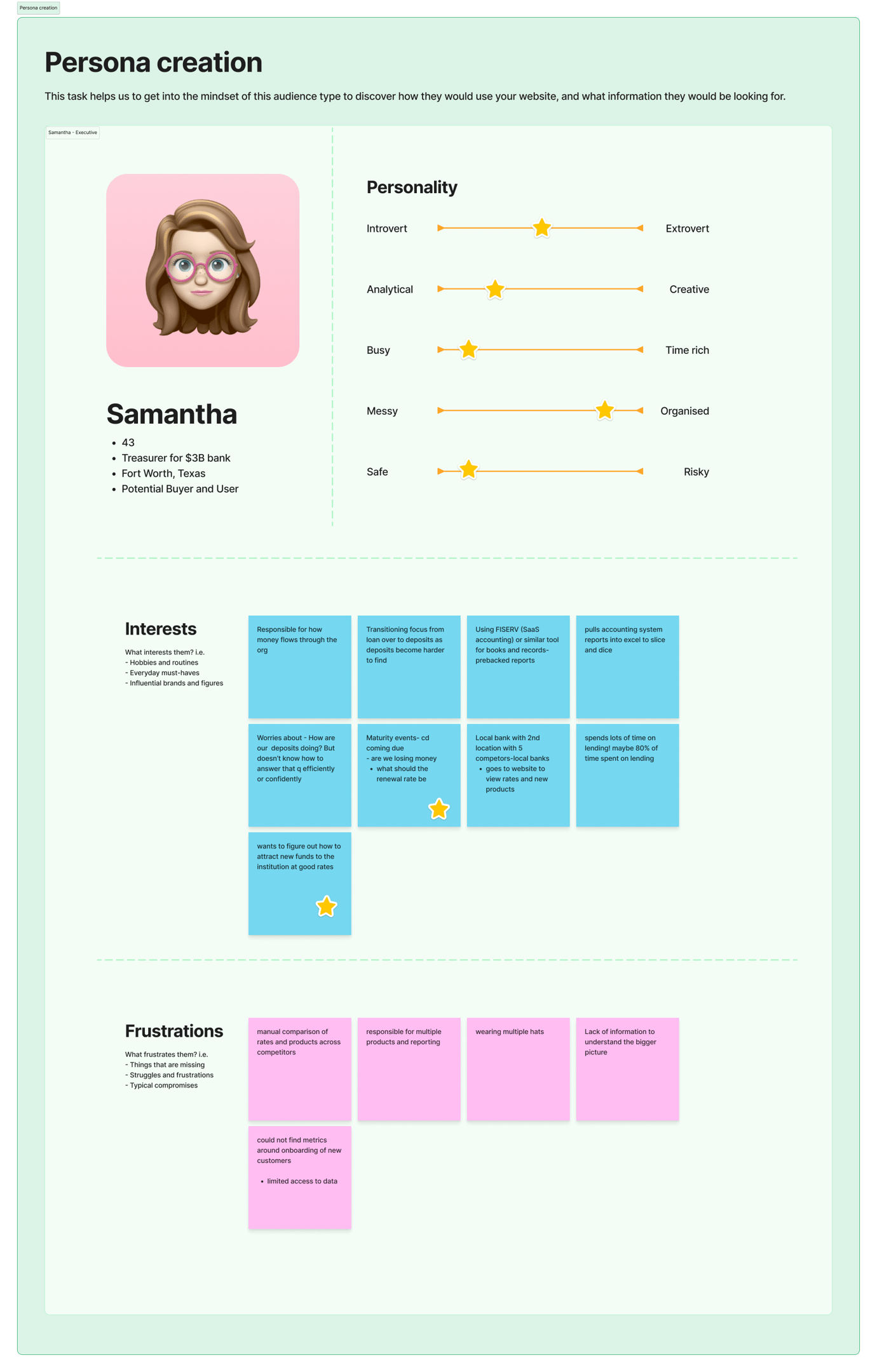
The Discovery
With a solid understanding of our target users and their challenges, we were able to define a proto persona of our 'ideal' user. We anticipated that over half of our users would be time constrained executives who need high level summaries of their data.
The Framework
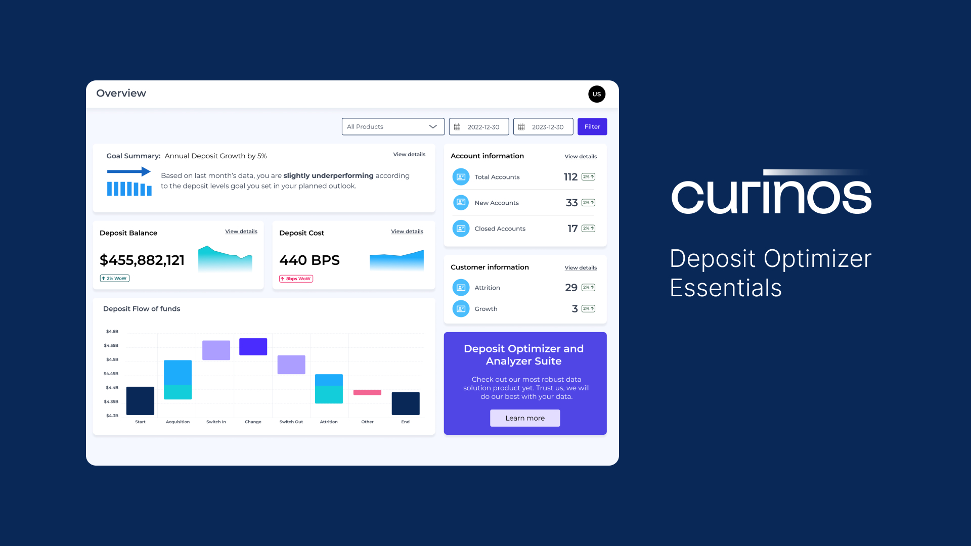
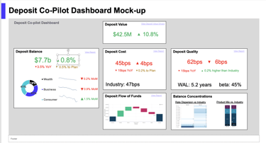
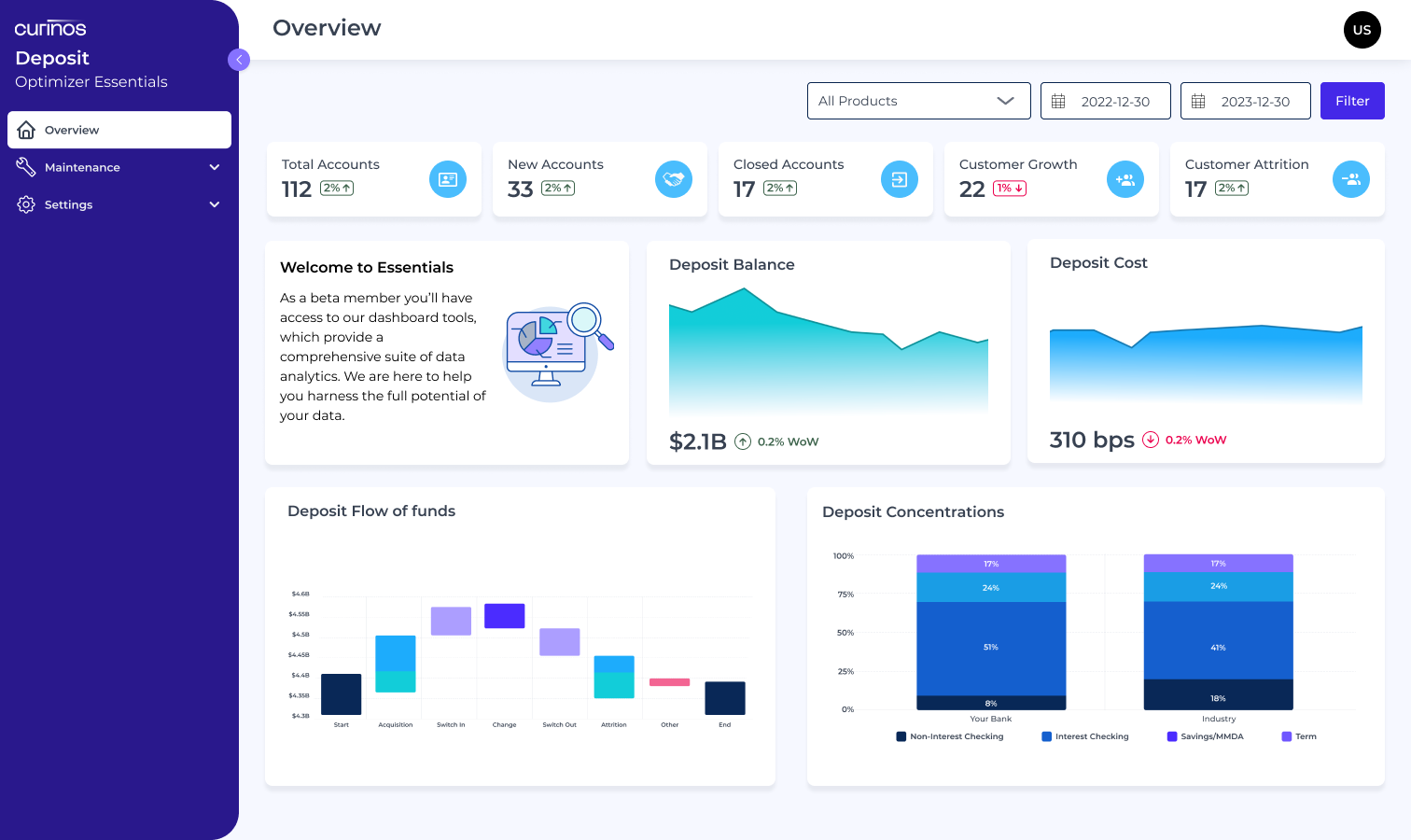
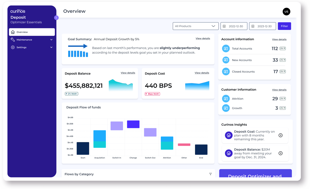
Given our goal of creating a summary view for our time-constrained users, we streamlined the user flow to focus on one activity (for our MVP): reviewing the dashboard.
This meant that the dashboard needed to be insightful yet easy to read, which is tougher than it seems given the large amount of data to sift through. So I started small, with 4-6 initial widgets concepts that would deliver actionable data points.
I reviewed these concepts with our product owner to verify widget layout and priority, and key data to display given current bank rates and market conditions, which can help them predict money movement according to account or user types.
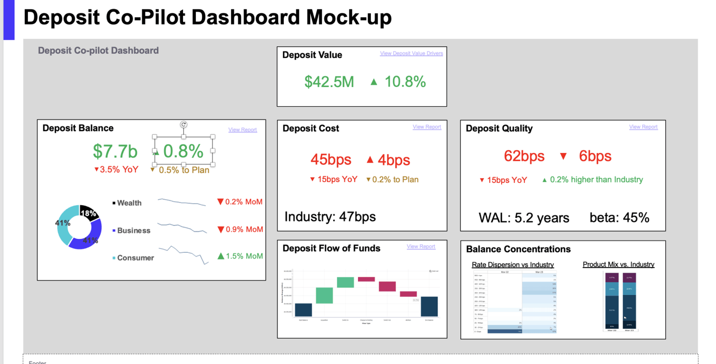
With tentative approval from our product owner I moved forward and utilized the existing Curinos style guidelines and design system to give the dashboard a more unique feel. I then reviewed my design decisions with my PM and our engineers to make sure they were feasible, but they had some concerns and useful feedback for us.
Crucial Feedback
One thing we learned from our engineering reviews was that all the data pipelines needed to feed each widget were not ready yet. This in turn limited our ability to deliver as many widgets as we had originally planned, so we had to pivot.
I took this opportunity to understand which data pipelines were ready and proposed we re-use one main pipeline to feed smaller ‘summary tiles’ to make up for our lost widgets. This was seen as a good pivot by my product manager and an easy task for our data engineers to complete. Win-win!
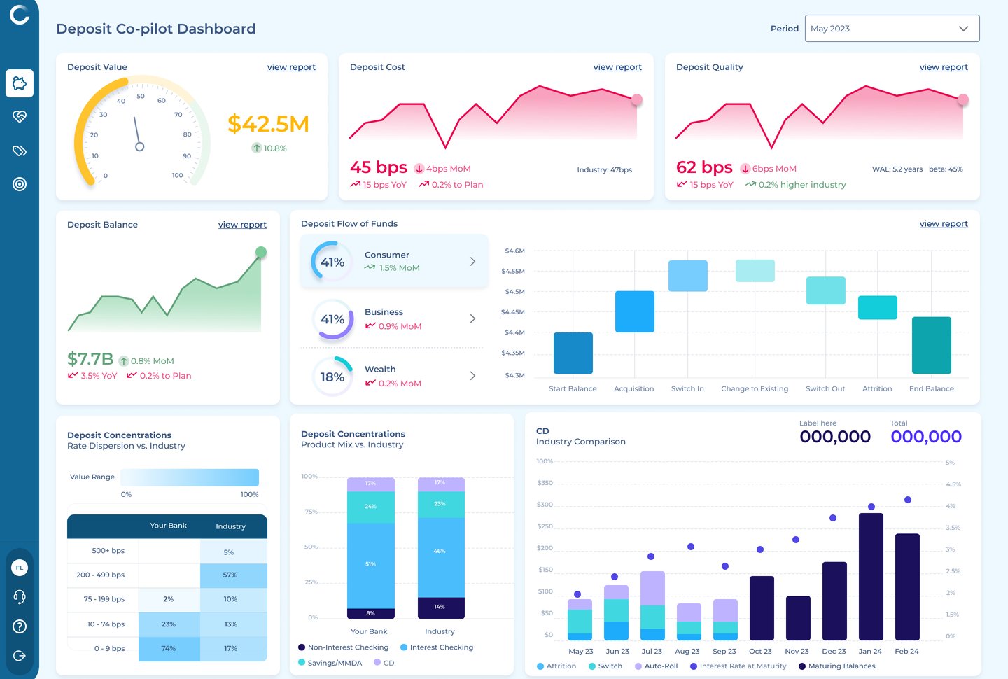
Additionally our product owner had some last minute thoughts about my use of colors, which she felt might be too different from our legacy products. So I utilized our main indigo throughout the dashboard to bring a subliminal sense of calm and trust while users scanned through many changing numbers and graphs. This also brought it back into brand standards - a plus for my product owner.
The Execution
Beta program testing
We established a beta program to run alongside our MVP release in Q2. This would give our first two clients early access to our beta release and allow us to get direct feedback and test early design concepts. In return we would provide white-glove support for any technical issues, questions, or concerns during the program.
Refining the design
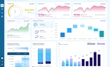
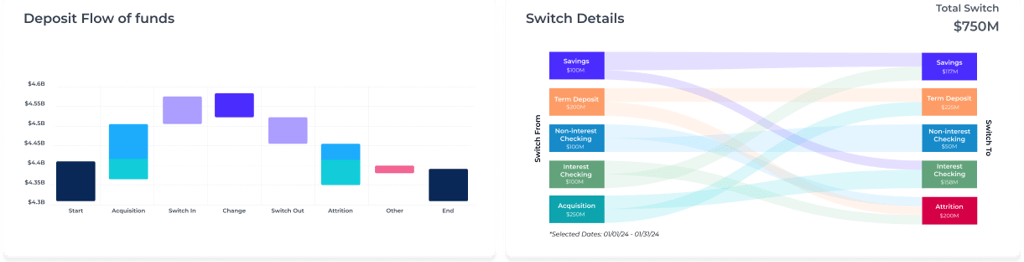
#1 Timely insights: Our main two clients' main feedback centered around seeing more details about their customers' money movement. These calculations are particularly relevant during the early part of the year when they see increased activity and fluctuations in deposit transactions, so we added a Switch Details view to give them more ways to drill down into this information.
#2 Creating a story: Our initial design had been well received and was found to be functional, but clients weren't sure how to interpret the data or where to focus in order to get insights. This made us revisit the layout of the widgets, so I turned to the time tested F pattern. Helping guide our user’s eyes starting with ‘today’s summary,’ into account changes, and then core deposit metrics.
These insights helped improve our user's journey into their data, but most importantly they were no longer looking at a static layout of widgets trying to grab their attention all at the same time.
After these improvements (and pressure to move on to the next feature), I felt good enough to move forward with the design because I knew it would be easy to iterate on our base layout and pivot if needed.
The Impact
Following the release of our initial MVP we received positive feedback, and our analytics tool indicated strong user engagement during the first month with about one client login per week - meeting our short term goal. This gave our team a strong start with the next steps being: increasing engagement, incremental enhancements, and adding new feature focused on forecasting future trends.
Measures of Success
Short term goals we met:
100% user engagement measured in bi-weekly feedback surveys
1 weekly login per client during the first month
Future long-term goals:
General revenue target of $4M by the end of the year
8-10 New Clients by the end of Q4