Bank of America
Bank of America aimed to develop a mobile onboarding application to streamline the employee onboarding process. This solution would replace the fragmented manual system, enhancing the user experience while significantly reducing the time and resources required.
The business goals were to shorten the time to hire, minimize handoffs between partners, and lower costs. For the user, the focus was on increasing process visibility, reducing paperwork and data duplication, and streamlining the overall experience.
The problem:
The solution:
Develop a mobile-first application that unifies various platforms used by the bank to collect data into one efficient system, enabling prospective employees to complete their onboarding tasks seamlessly within a single experience.
Me and two other UX designers
My team:
Timeframe:
2 months
Refining our insights
The bank had already conducted preliminary research to identify user pain points, allowing my team and me to focus on generating solutions. We discovered numerous handoffs between internal teams and external vendors, complicating the process. From the user’s perspective, communication was a major issue—they were receiving emails from recruiters, vendors, and the bank, making the experience feel overwhelming and disjointed. Additionally, users had little visibility into their progress, which added to their frustration and lack of clarity.
Defining Information Architecture
The team's original wireframes and screens lacked a clear structure for the primary actions new users needed to complete. Given the pain points we had refined—such as overwhelming communication and limited visibility for users—I took the initiative to design a more streamlined information architecture.
I based it on the key stages of the hiring platforms and screening documents provided by stakeholders. To address the frustration caused by complex handoffs, I simplified the process by skipping unnecessary steps, focusing instead on creating a seamless flow that allowed users to easily complete the most critical tasks.
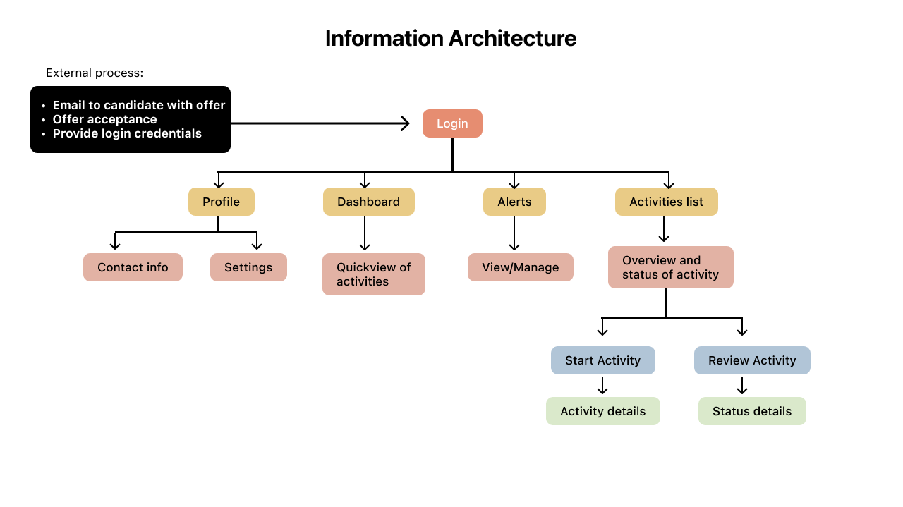
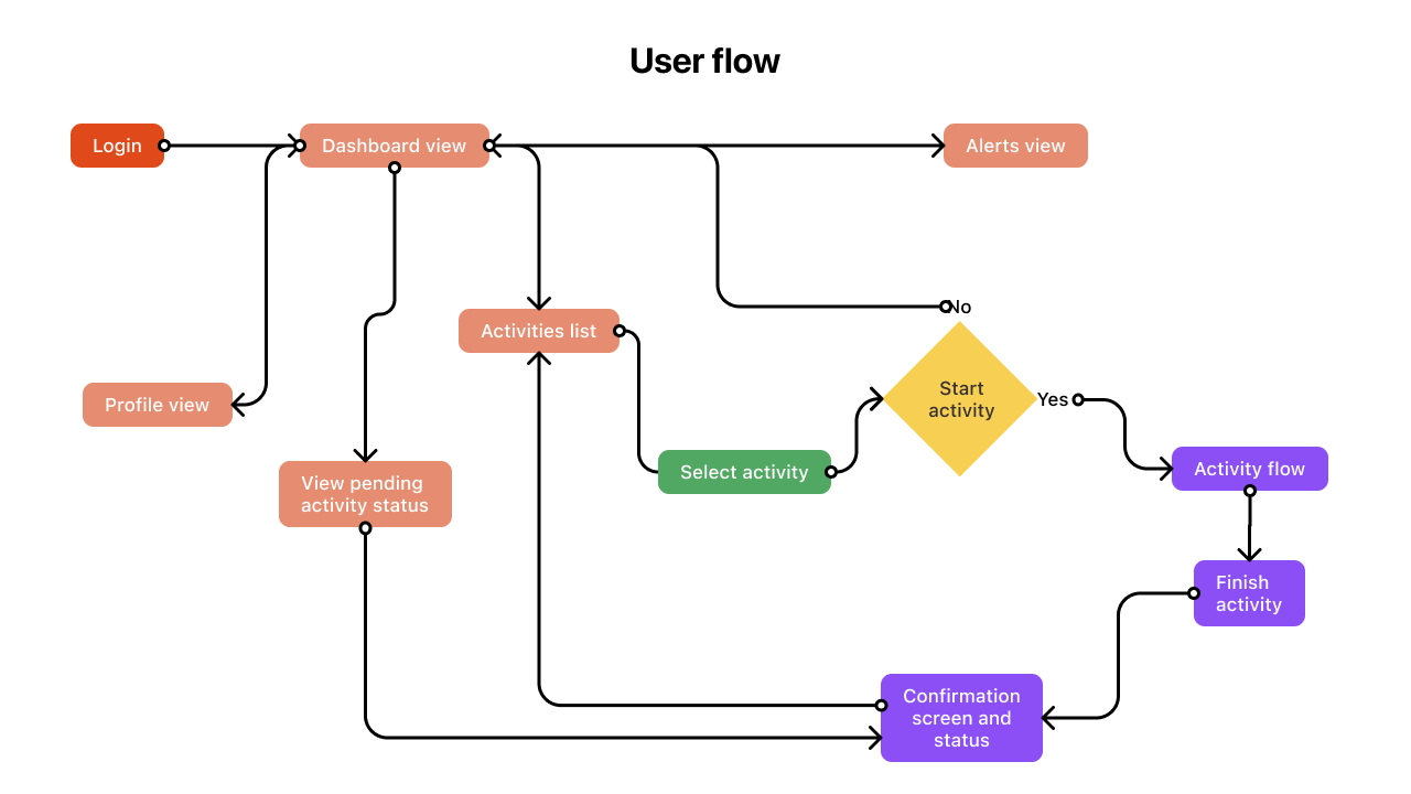
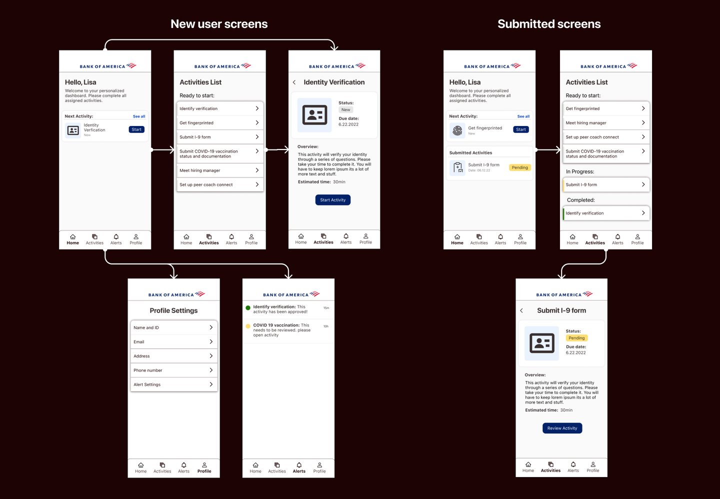
This helped the team understand how the user could find their way around the app. We got a better sense of the logical flow of steps that the user may take while using our product. I decided to layout a general flow for a first time user and the screens they would see upon initial login.
Task and user flow
Lo-fi wireframes and testing
The team had not yet tested their initial wireframes of the lo-fi prototype. Seeing an opportunity to gather valuable feedback, I collaborated with a user researcher to identify internal users and conduct a usability study, using their input to better understand how the design was resonating with real users.
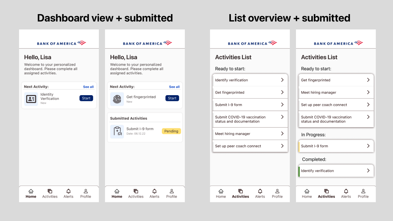
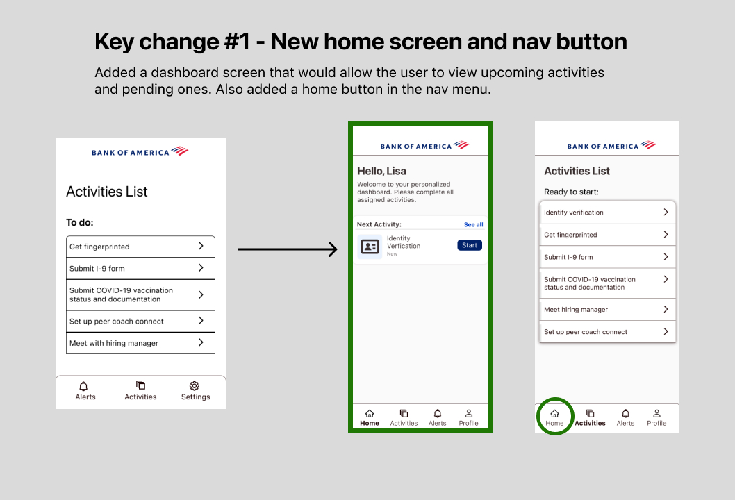
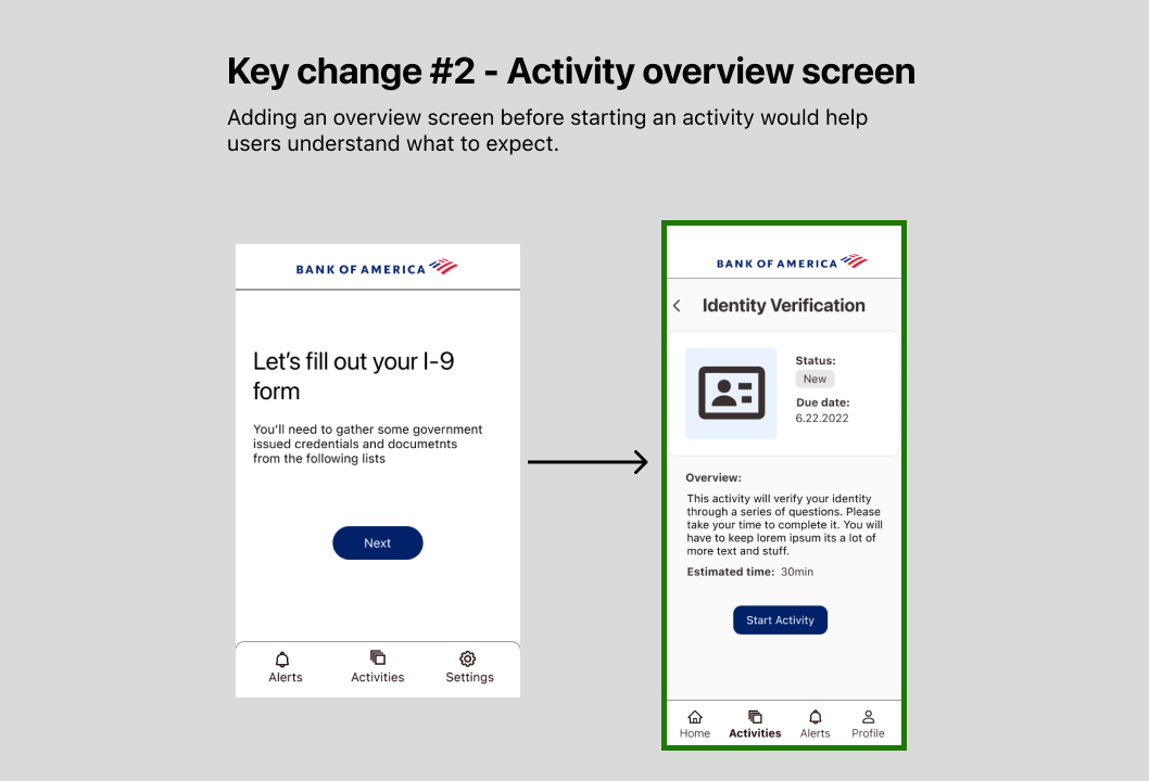
First learning: users did not like how the app would jump straight into the activities list and that each activity did not have an overview to explain what they needed to do.
Second learning: users could not navigate around the app with ease. Many pointed out that the app should include a way to jump back to the home screen and that it was missing from the nav menu.
Applying feedback in the designs
Prototype and Hand-off
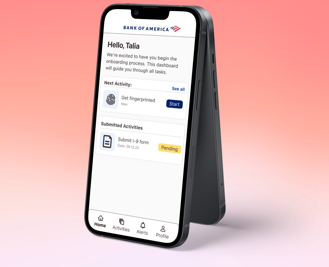
From the usability study, we learned that users needed clearer navigation and more visibility into their progress. In response, I reimagined the user journey by adding overview screens to the flow, giving users a better sense of where they were in the process. I also refined UI elements, such as whitespace, color, and visual hierarchy, to enhance usability and clarity. Leveraging components from the Helix design system, I developed a high-fidelity prototype that was ready for handoff. To ensure an efficient build, I worked closely with the developers, providing detailed specifications and component references, making the transition from design to development seamless.
Measure of Success
After releasing the first version of the app we saw a clear reduction in time spent on the activities that we digitized. The combined time spent was reduced by 5 days on the users end, which in turn helped reduce the internal teams onboarding processing time by 1 week.
5 Days
Time saved